- All of Microsoft

Power Apps Progress bar with Modern Controls
Master Power Apps Modern Control with an in-depth guide to building progress bars in a Canvas App, featuring data collection orchestration.
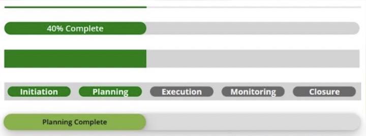
The latest video tutorial from Damien Bird [MVP] explores different ways to build progressive bars in a Canvas App utilizing the Power Apps Modern Control. The tutorial outlines five distinct ways, including using the modern control, buttons, galleries or containers. Damien presents us step by step on how to assemble a collection of data that helps to regulate these bars, showing percentages, and current stages.
This information is useful as it could easily be included as part of a customized component in the application. Some of the methods discussed include adding the modern control, using buttons, and the method of integrating galleries and buttons with containers.
One of the advantages of these progress bars is that they can be configured in different manners based on the requirement. They showcase exact progress or on-going activities, thus making them highly adaptable.
including the modern control, using buttons, galleries or containers. In this
video I will demonstrate how you can create a collection of data to orchestrate
these bars, display percentages or current stages on the bar. This material is
repeatable and could even be included as part of a custom component.
01:05 Demo of Progress Bars
02:13 Setting up the collection and gallery
06:00 Option 1 Adding the modern control
08:00 Adding a container
08:35 Option 2 Using Buttons
12:56 Option 3 Using Gallieries
15:12 Option 4 Using Galleries and Buttons
18:54 Option 5 Using Containers
23:25 Outro
Some key properties to consider when setting up these progress bars include thickness, shape, color, value and max. Thickness refers to the thickness of the progress bar while shape refers to its geometrical shape. Users can also optionally set the bar to determinate or indeterminate.
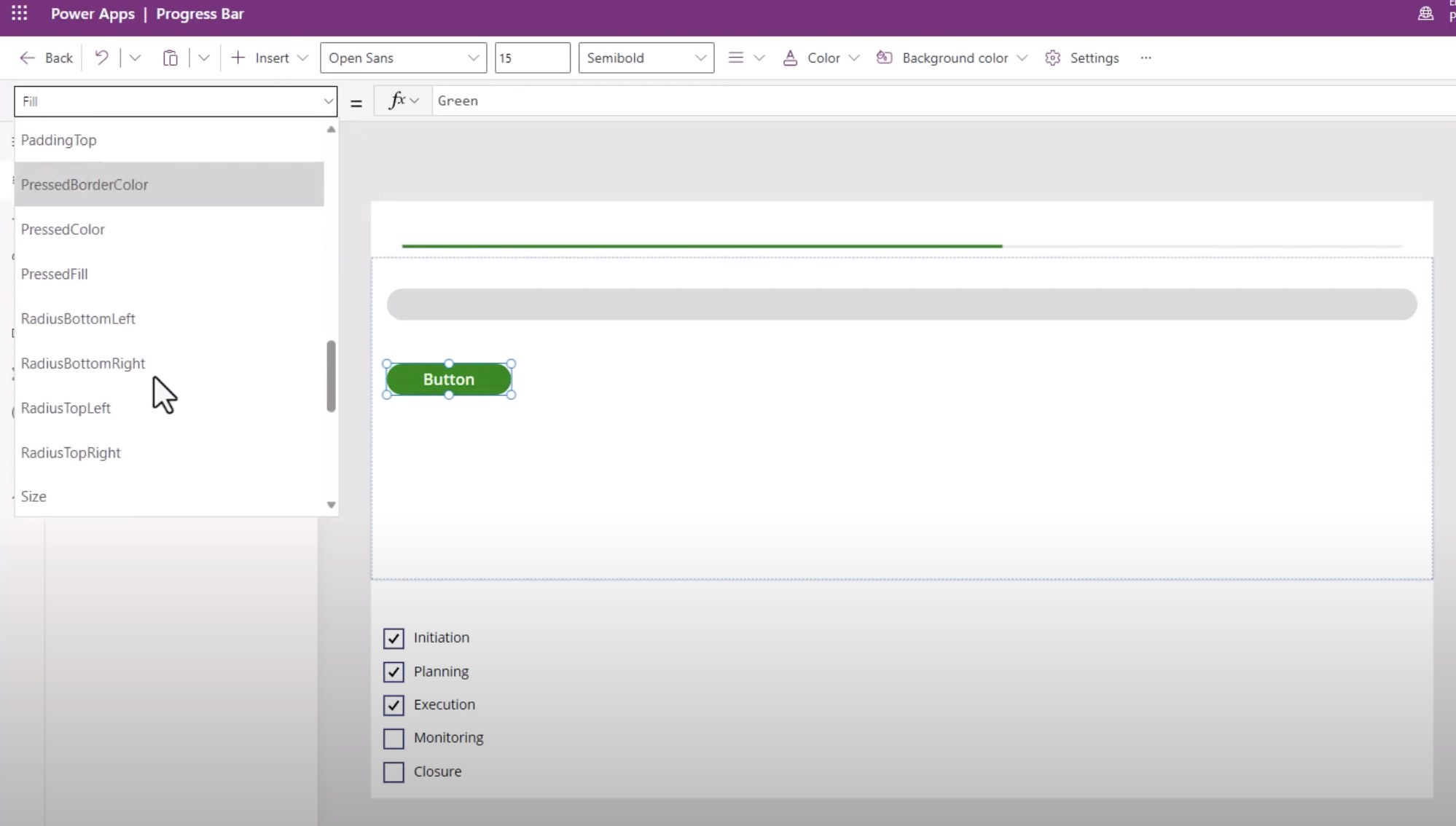
Color coding can serve an efficient means to display various states of progress. This functionality uses default, error, warning, and success states using 'default', 'red', 'orange' and 'green' respectively.
'Value' is defined as a decimal number between 0 and 'max', and it specifies how much of the task has been accomplished. When the value equals max, it indicates that the task is complete and the progress bar will be full. This is particularly useful to show capacity or how much of a total has been uploaded or downloaded.
Additional properties of this modern control feature includes properties such as Accessible Label, X and Y coordinates and Size. Here, Accessible label is specifically designed for screen readers. X and Y references to the edge distance of the control from its parent container, while Size refers to the control's size on the canvas.
Dig Deeper Into Power Apps Modern Control
Power Apps Modern Control offers a range of possibilities not limited to the construction of progress bars. This versatile tool can be customized to fit a myriad of functionalities in an app. Its flexible properties allow developers to alter and adjust components based on specific needs, making the Power Apps Modern Control an essential tool for any developer.
Learn about Power Apps Modern Control: How to Create a Progress Bar
In today's digital world, visual indications like progress bars have become indispensable for user experiences. This You Tube video takes you through the creation of a progress bar in a Canvas App, introducing multiple methods, including the groundbreaking control, using buttons, galleries or containers. It presents a material repeatable enough to be incorporated into a custom element.
The video begins with an introduction, followed by a demo of the progress bars. It then moves on to setting up the collection and gallery. These procedures form the basic foundation for creating the interactive visual element we're dealing with.
There are five options presented on ways to incorporate a progress bar, each showcasing a unique application approach. Using the new age tool, incorporating a container, using buttons, galleries, and then a combo of galleries and buttons. The final method involves using only containers. Each method is unique and offers a unique approach to handle the task.

For the efficient representation of ongoing or exact progress, the progress display can be set as determinate or indeterminate. This holistic tool serves to inform users about their progress or show loading scenarios in a user-friendly manner.
This tool can be tailored to reflect various stages of progress within an app, thanks to its Key and Additional properties including: the thickness and shape of the bar and track, the color prop which can be used to reflect a "brand" state (default), "error" state (red), "warning" state (orange), or "success" state (green). The value property shows how much of a task is complete, and Max represents the task's completion, signaling a full progress bar.
This app-enhancing mechanism also features an Accessible label for screen readers. X represents the distance between the control's left edge and the left edge of the parent container (or the screen if there's no parent container). Similarly, Y represents the distance between the controls top edge and the top edge of its parent container (or the screen if no parent container exists). Besides, "size" contributes to the controls' size on the canvas.
- Thickness – Dictates the bar's thickness.
- Shape – Influences the bar and track's looks.
- Indeterminate – This property allows setting the bar as determinate or indeterminate.
- Value – Indicates how much task has been completed.
- Max - Signals the task's completion, indicating a full bar.
This digitized tool isn't just a visual aid but also a crucial building block in constructing a customized user interface within an application. Additional resources, as mentioned in the article, could assist in better utilization of these properties.
In conclusion, this versatile tool can become a game-changer while crafting an interactive and user-friendly application interface. Its variable properties offer a broad spectrum of customization, catering to a diverse range of tasks and user-specific requirements. It's an indispensable tool for anyone venturing into or established in the realm of interactive applications.
- Progress bar modern control in Power Apps
- Mar 27, 2023 — The progress bar can be configured to show various states of progress in the apps. This versatile control can be used to inform users on ...
Keywords
Power Apps Modern Control, Create Progress Bar, Progress Bar Power Apps, Modern Control Tips, Progress Bar Creation, Power Apps Tutorials, Modern Control in Power Apps, Create Power Apps Progress Bar, How to Power Apps, Power Apps Progress Bar Guide