- All of Microsoft

Excel: Create Dashboards in 26 Minutes
Microsoft Excel dashboard tutorial for analysts: build KPIs with pivot tables slicers map charts and interactive visuals
Key insights
- Data Setup: Clean and structure raw data first so formulas, pivot tables, and charts work reliably.
Use calculated columns for clear fields and keep a dedicated data sheet for refreshable sources. - KPIs: Define a small set of business questions and matching metrics before designing visuals.
Prioritize clear, measurable KPIs that answer who, what, when, and where for fast insights. - Pivot Tables: Treat pivots as the dashboard’s calculation engine to summarise large datasets quickly.
Use pivot grouping, value formats, and linked pivot ranges to feed your charts and grids. - Charts and Design: Choose simple, consistent chart types and add strong, descriptive titles for storytelling.
Include maps, combo charts, and clean formatting to highlight trends without clutter. - Slicers: Add slicers, timelines, and picture links to let users filter and explore data interactively.
Design a side panel or navigation area so interactions feel natural and fast. - Power Query & Copilot: Use Power Query and Power Pivot for repeatable data transforms and relationships.
Leverage AI features to speed routine tasks, but validate generated logic and calculations manually.
Overview of the video
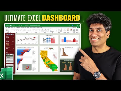
In a clear and focused tutorial, Excel educator Chandoo demonstrates how to build a complete Dashboard in roughly 26 minutes, taking viewers from raw data to a polished, interactive result. The video frames the project as an end-to-end example for business analysts, highlighting how to set up data, define KPIs, and assemble visuals that answer specific business questions. Moreover, Chandoo balances rapid execution with practical explanations, so viewers can follow the steps and then explore details at their own pace. Consequently, the tutorial serves both as a quick walkthrough and as a foundation for deeper learning.
Step-by-step workflow and key techniques
The presenter first shows how to prepare the dataset and build the calculation engine using Pivot Tables and calculated columns, and then explains how to structure the dashboard canvas with shapes and formatting. Next, he demonstrates a range of chart types, including trend graphs, distribution charts, a geographical Map chart, and a grid-style visualization built with picture links, while also adding interactive controls such as slicers. In addition, the tutorial covers display formatting, chart titles, and theming so the final product looks professional and supports storytelling. This sequence makes it easy for learners to see how each step feeds the next and how visual design supports analytical clarity.
Chandoo also uses practical timestamps to guide viewers through topics, making it simple to jump to sections like KPI setup, pivot grouping, or slicer configuration. He shares a downloadable sample file so users can replicate the steps offline and practice, which reinforces learning through hands-on work. Furthermore, the video emphasizes thinking like a business analyst: asking the right questions, selecting the right metrics, and arranging summaries and details to guide decision makers. As a result, the lesson is both tactical—showing exact Excel steps—and strategic—demonstrating how to shape a narrative from data.
Tradeoffs in speed versus depth and tool selection
The tutorial's rapid pace highlights an important tradeoff: speed of delivery versus depth of explanation. On one hand, producing a polished Dashboard quickly shows what is possible and keeps learners motivated; however, on the other hand, it can under-emphasize edge-case handling and complex data-cleaning scenarios that real projects often require. Likewise, the video favors traditional Excel features like Pivot Tables and manual formatting for accessibility, while mentioning advanced tools such as Power Query, Power Pivot, and DAX as alternatives that add power but also complexity. Therefore, analysts must weigh the need for maintainability and performance against the immediate benefits of speed and direct manipulation within the worksheet.
Challenges when building interactive dashboards
Building interactive dashboards in Excel brings technical and design challenges that the video acknowledges, even if not every issue can be resolved in a short tutorial. For instance, large datasets can slow workbook performance, and complex relationships between slicers and pivot caches can lead to unexpected filter behavior unless sources are carefully normalized and cached. In addition, features like Map charts or picture-link visual grids sometimes behave inconsistently across Excel versions and require cautious testing before sharing widely. Finally, while automation tools and AI assistants can speed some tasks, they can also obscure logic, so teams should document steps and maintain clear calculation engines for long-term reuse.
Practical takeaways for analysts and teams
For analysts who want immediate impact, the video offers a practical blueprint: prepare clean data, define concise KPIs, use Pivot Tables as the calculation backbone, and layer visuals with interactivity to support exploration. Moreover, by practicing with the provided sample file and experimenting with slicer interactions and theming, users can quickly build repeatable templates for recurring reports. However, teams should plan for tradeoffs by choosing the right balance of manual workbook techniques versus scalable tools like Power Query or dedicated BI platforms when data size or refresh needs grow. In short, Chandoo’s tutorial is an efficient starting point that points toward both immediate application and the next steps for building robust, maintainable dashboards.

Keywords
excel dashboard tutorial, create excel dashboard in 26 minutes, excel dashboard for beginners, interactive excel dashboard tutorial, free excel dashboard templates, excel dashboard tips and tricks, pivot table dashboard excel, power query dashboard tutorial