- All of Microsoft
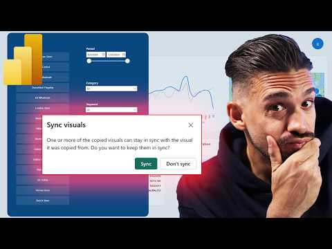
Power BI: Hidden Slicer Explained
Microsoft expert decodes Power BI slicer for smarter report design with Fabric, Copilot, DAX and AI tips
Key insights
- Slicer: Power BI slicers are interactive filter visuals on the report canvas that let users narrow data for other visuals. Use the Input slicer when free-text filtering works better than picking from a list.
- Hidden slicers and Sync: A slicer can be hidden but still affect pages if it is synced. Always check sync settings when filters behave unexpectedly.
- Format pane and Slicer settings: Microsoft moved most slicer formatting into the Format pane. Change styles (list, dropdown, tile) and visual options there for consistent report design.
- Selection controls and Edit interactions: Selection controls set single-select, multi-select, or select-all. Use Edit interactions to choose whether a slicer filters, highlights, or ignores each visual.
- Selection pane and Sync slicers pane: Open the Selection pane to find hidden slicers and the Sync slicers pane to see where each slicer applies. These two tools fix most confusing behaviors.
- Bookmarks and advanced patterns: Use bookmarks to hide/show slicer panels, use synced slicers to drive multiple pages, and pick tile-style or input slicers for cleaner user experiences.
The YouTube video from the channel How to Power BI examines what the creator calls Power BI's "most mysterious slicer setting." In clear steps, the presenter walks viewers through why slicers can behave unexpectedly after recent interface updates. Consequently, the video focuses on a cluster of settings—rather than a single hidden switch—that commonly produce confusion for report designers and consumers.
What the video demonstrates
First, the presenter explains that a slicer is a visual filter placed on the report canvas and that newer Power BI versions moved many configuration options into the Format pane. Then, the video shows how style choices, selection controls, and syncing options can interact to produce surprising results. For example, a slicer hidden on one page can still filter visuals on another page if it remains synced, and viewers may not immediately realize why values change.
Next, the tutorial demonstrates practical checks that uncover hidden behavior, such as inspecting the Selection pane and the Sync slicers pane. The presenter also highlights the Edit interactions control for changing whether a slicer filters or highlights a visual. As a result, the video aims to shift viewers from guessing to a methodical troubleshooting process.
Why slicers feel mysterious
The video argues that the mystery stems from several overlapping features that are easy to overlook, especially after UI consolidation. For instance, the centralization of formatting in the Format pane improves consistency but can reduce discoverability, leaving some settings effectively hidden unless designers know where to look. Therefore, the apparent mystery is more about discoverability than about a single secret option.
Furthermore, the presenter notes that default behaviors—such as slicers applying filters to all visuals—often catch users by surprise. Meanwhile, selection control options like single-select or select-all change how end users interact with a slicer and influence report navigation. Consequently, report authors must balance default convenience with explicit configuration to avoid confusing consumers.
Practical checks and troubleshooting steps
The video lays out a set of practical checks that should become routine for report designers. First, the presenter advises opening the Selection pane to find hidden slicers and then examining the Sync slicers pane to see whether a slicer is affecting other pages even when it is hidden on the current one. Additionally, checking Edit interactions helps determine if the slicer is set to filter, highlight, or ignore specific visuals.
Similarly, the tutorial recommends reviewing the Slicer settings under the Format pane to confirm the chosen style and input behavior. The video shows how switching between classic list, dropdown, tile, and input slicer modes can change both the user experience and performance, so designers should test each mode with representative data. In short, methodical checks reduce surprises and improve report predictability.
Advanced patterns and tradeoffs
Beyond basic fixes, the presenter explores advanced patterns such as synced slicers, bookmark-driven show/hide panels, and the use of input slicers for free-text filtering. These patterns enhance report flexibility, but they also introduce tradeoffs. For example, syncing a slicer across pages improves consistency, yet it increases the risk that a hidden or forgotten slicer will continue to filter reports unexpectedly.
Moreover, the video highlights performance and usability tradeoffs when choosing slicer types. Tile-style and button-like slicers can improve clarity for end users, but they may require more layout work. Conversely, input slicers can speed searches when users know what to type, but they may not be ideal when users prefer browsing a short, visible list of values. Therefore, designers must weigh discoverability, performance, and user preference when selecting a pattern.
Design implications and challenges
Finally, the video emphasizes that the root challenge is balancing a clean design with transparent behavior. While hiding slicers or using bookmarks can make dashboards look neater, those choices can also obscure logic and create maintenance burdens. Consequently, the presenter urges designers to document key slicer behaviors and test reports with real users before publishing.
In conclusion, the video by How to Power BI reframes the "mystery" as a human problem of discoverability and configuration rather than a single cryptic option. By following the suggested checks and considering the tradeoffs between style, syncing, and interaction controls, designers can create clearer and more reliable Power BI reports. Ultimately, the best approach combines consistent configuration, user testing, and simple documentation to reduce surprises for report consumers.

Keywords
Power BI slicer settings, Power BI single select slicer, Power BI multi-select slicer, Power BI slicer selection controls, Power BI slicer behavior explained, Power BI sync slicers tutorial, Power BI slicer mysterious setting, Power BI slicer tips and tricks