Data Analytics
- All of Microsoft
Zeitspanne
explore our new search

Power BI
13. Apr 2025 19:07
Unleash Power BI: Create Stunning Waterfall Visuals with Just 10 DAX Lines!
von HubSite 365 über Injae Park
Technical Lead - Business Intelligence • Microsoft Certified PL-300 • Data Analyst • Power BI Youtube
Power BI, DAX, Data Visualization
Key insights
- Visual Calculations in Power BI enable users to create dynamic calculations directly within a visual, simplifying the process of building waterfall charts.
- Using visual calculations allows leveraging DAX functions like RUNNINGSUM() for dynamically calculating running totals and visual reforms directly on the chart.
- The approach reduces the complexity of DAX, making it more accessible for users to create advanced calculations without extensive model editing.
- Simplified DAX Usage: Visual calculations operate on aggregated data rather than individual records, offering performance improvements compared to traditional measures.
- The new method streamlines calculations by performing them directly on visuals, enhancing flexibility and adaptability without changing underlying models.
- While currently in preview, visual calculations already simplify data analysis processes and enhance Power BI's capabilities for business intelligence tasks.
Introduction to Power BI Waterfall Charts
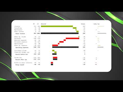
In recent years, Power BI has evolved into a robust platform for data visualization, offering users a wide variety of tools to represent complex data sets in meaningful ways. Among these tools, waterfall charts have gained significant attention due to their ability to illustrate cumulative changes in data over time. A recent YouTube video by Injae Park, titled "Power BI Waterfalls in 10 Lines of DAX | Visual Calculations," highlights a method for creating these charts using visual calculations and DAX within Power BI. This innovative approach simplifies the process, making it accessible even for those with limited experience in data modeling.Understanding Visual Calculations in Power BI
Visual calculations in Power BI present a new way to handle data directly within visuals, allowing users to create dynamic calculations without extensive model editing. This method is particularly valuable for constructing waterfall charts, which are ideal for showing how various factors contribute to a final result, such as profit changes over time. By using DAX functions like RUNNINGSUM(), users can compute running totals and other dynamic metrics directly on the chart. This capability not only streamlines the creation process but also enhances the flexibility and adaptability of the analysis.Advantages of Using Visual Calculations
The introduction of visual calculations in Power BI brings several advantages. Firstly, they significantly reduce the complexity of DAX, making it easier for users to develop advanced calculations without modifying the data model extensively. This simplification lowers the barrier for entry, enabling a broader audience to leverage Power BI's powerful analytical capabilities. Secondly, because visual calculations operate on aggregated data rather than individual records, they often provide performance benefits compared to traditional measures. Lastly, visual calculations are highly flexible, as they can reference the structure of the visual itself, allowing for more context-dependent and adaptable analyses. This flexibility is crucial in scenarios where data structures or analytical needs frequently change.Implementing Waterfall Charts with Visual Calculations
Creating a waterfall chart using visual calculations in Power BI involves several key steps. Initially, users must import and prepare their data within Power BI Desktop, ensuring that all relevant data is available for analysis. The next step is to define measures using DAX, such as running sums, which will feed into the waterfall chart. Once these measures are established, they can be added to the waterfall chart visual, along with the necessary categories. Customizing the visual is the final step, where users can adjust formatting and breakdowns to enhance clarity and emphasize critical insights.Innovations and Future Prospects
The new approach of integrating visual calculations into Power BI represents a significant innovation in data visualization. By allowing calculations to be performed directly on visuals, users can streamline their workflows and avoid complex model adjustments. This capability enhances the flexibility of Power BI charts, enabling them to quickly adapt to different data structures or analytical scenarios. While visual calculations are currently in preview, they already offer substantial advantages in simplifying data analysis processes. As Microsoft continues to develop and refine Power BI's functionalities, further enhancements to visual calculations are expected, potentially unlocking even greater capabilities in the future.Challenges and Considerations
Despite their benefits, visual calculations come with certain challenges that users must consider. One limitation is that these calculations cannot access model-level functions that rely on relationships, which may constrain their application in some scenarios. Additionally, as visual calculations are still in development, users must stay informed about updates and changes that Microsoft may introduce. Balancing these considerations is crucial for organizations looking to leverage visual calculations effectively. Ultimately, using visual calculations to create waterfall charts in Power BI represents a significant advancement in data visualization, offering simpler, more flexible analysis methods that can enhance organizational insights and decision-making processes.

Keywords
Power BI Waterfalls DAX Visual Calculations Data Analysis Business Intelligence Dashboard Design Advanced Analytics Reporting Tools