- All of Microsoft
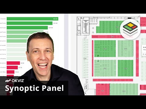
Power BI: Synoptic Panel for Shelves
Microsoft Power BI: visualize supermarket product placement with Synoptic Panel to improve sales margins and layout
Key insights
- Synoptic Panel: A custom Power BI visual that turns store floor plans into interactive maps so you can see sales and margin KPIs directly where products sit.
It helps you connect layout and performance at a glance. - Map preparation: Use a store image (SVG, PNG, JPG), define areas with the designer, and name each area to match your data columns.
This step links physical shelves and zones to your Power BI model. - Data binding: Bind a category column to map areas and add measures like sales or margin % to color-code zones.
Color and saturation show performance so teams can spot high- and low-performing spots quickly. - Drill-down and levels: Create multi-level maps to move from store view to department to individual shelves.
You can isolate zones, drill into details, and compare performance across levels on the same report page. - Interactive analysis: Switch measures instantly, filter areas, and use the integrated map editor to adjust maps without leaving Power BI.
The visual supports multiple SVG maps and dynamic views for targeted commercial decisions. - Business use: Retail teams use this spatial analysis to optimize product placement, improve margins, and plan layouts.
Sample data may be fictitious, but the approach reflects real customer use and practical gains.
Introduction
This article summarizes a recent YouTube video by SQLBI that demonstrates how retailers can optimize supermarket product placement using the Synoptic Panel visual in Power BI. The video presents a practical use case in which sales and margin metrics are overlaid on a store floor plan to reveal spatial patterns that traditional charts miss. In addition, the presenter uses a fictitious dataset to illustrate typical insights while emphasizing that the approach reflects real-world customer deployments.
Consequently, viewers can see how visualizing performance directly on the store map helps teams make faster layout decisions. Moreover, the video walks through preparing maps, binding data, and drilling from category zones down to individual shelves. As a result, the technique connects point-of-sale metrics to specific locations in the store.
How the Synoptic Panel Works
The video explains a clear workflow for turning a store image into an interactive map. First, a store layout is prepared in a format such as SVG, then areas are defined and named so they match columns in the data model, and finally the configured map is imported into the Synoptic Panel visual.
Next, the presenter shows how to bind category and measure fields so each zone on the map reflects values like sales, margin percentage, or inventory velocity. The visual supports multi-level navigation, letting analysts drill from an entire floor plan into departments or shelf-level detail. Furthermore, integrated editing tools make quick adjustments to labels and bindings without leaving the report environment.
Practical Benefits for Retailers
By mapping KPIs directly on a store layout, retailers gain spatial intelligence that supports merchandising and commercial choices. For instance, teams can instantly spot high-performing zones and identify underperforming aisles where a layout change or promotional push might increase sales.
Moreover, the video highlights how switching measures on the fly—such as toggling between sales value and margin percentage—helps staff prioritize actions that improve profitability rather than just volume. The capability to isolate specific zones and drill down to shelves also aids inventory planning, merchandising audits, and local promotions, leading to more focused experiments on the shop floor.
Tradeoffs and Challenges
Although spatial visualization adds clarity, the approach involves tradeoffs that teams must weigh carefully. For example, increasing map detail improves precision but can slow report performance, especially when many SVG maps or high-resolution graphics load on the same page. Therefore, balancing visual fidelity with report speed becomes an important design decision.
Additionally, the technique relies on consistent naming and clean data to ensure areas map correctly to sales records, and this can require substantial data preparation work. Likewise, organizations must decide on the right level of granularity: showing every shelf may reveal micro-level problems, but it can also expose sensitive commercial data and overwhelm users who need higher-level summaries.
Best Practices and Next Steps
To get the most value, the video recommends standardizing area names and optimizing SVG files to reduce complexity, which improves loading time and compatibility. It also suggests using conditional formatting thoughtfully so color scales remain interpretable, and testing different aggregations to avoid misleading conclusions drawn from sparse data points.
Finally, the presenter advises pairing spatial analytics with controlled experiments, such as A/B tests or time-limited planogram changes, to validate whether layout adjustments drive measurable uplift. In conclusion, the YouTube video by SQLBI offers a practical, step-by-step demonstration of using Synoptic Panel in Power BI, while also underlining the operational and technical tradeoffs teams must manage when bringing map-driven insights into store decision-making.

Keywords
Power BI Synoptic Panel, supermarket product placement, retail shelf analytics, planogram optimization, visual merchandising Power BI, store layout analytics, shelf placement sales uplift, product heatmap visualization