- All of Microsoft
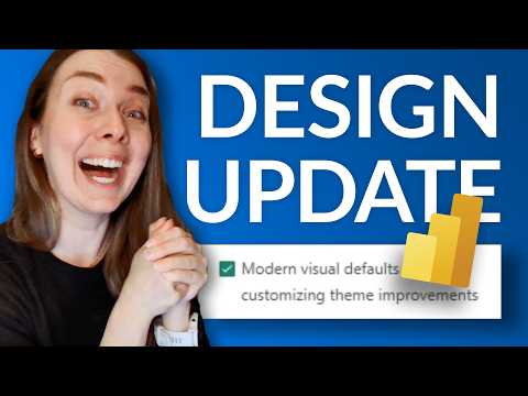
Power BI: Free Fluent 2 Design Upgrade
Microsoft expert: Power BI Fluent Two preview modernizes reports with grey canvas, slicers, style presets, custom sizes
Key insights
- Fluent 2 base theme: Power BI now offers a preview of the Fluent 2 base theme that applies a modern, consistent look to new report pages — grey canvas, rounded corners, better spacing, dropdown slicers, refreshed buttons, and a wider default page size.
Visuals start cleaner and more uniform without manual formatting. - Enable via Preview features: Turn it on in Power BI Desktop at File > Options and settings > Options > Preview features, check the modern visual defaults and theme improvements, then restart Power BI.
The change applies automatically to new pages after restart. - Canvas settings and custom sizing: Use the Canvas settings Size drop-down to pick common page sizes (HD, Full HD, QHD, 4K UHD) or enter your own dimensions with custom sizing.
This keeps standard aspect ratios available while letting you define exact layouts. - Apply to existing reports: Update older files with the new look using the theme switcher or import JSON themes that support the new schema.
Published reports keep the modern defaults when edited in the browser. - Key benefits: Expect faster polish and consistent visuals, improved readability with smoother chart lines and better spacing, and more usable slicers and tables (banded rows, expand/collapse).
Teams save time and get enterprise-ready dashboards by default. - Preview status and compatibility: This is a preview feature in Power BI Desktop and Microsoft Fabric, so Microsoft may refine behavior and options.
Watch before/after demos to decide when to roll it into production reports.
Summary of the video
In a recent YouTube video, the channel Guy in a Cube walks viewers through Power BI’s April 2026 preview feature that introduces the Fluent 2 base theme. The clip demonstrates how new reports gain a modern, consistent look by default, including a grey canvas, rounded corners, and improved spacing. It also shows how dropdown slicers, updated buttons, and refreshed table styles appear right away when the preview is enabled.
Moreover, the presenter compares before-and-after visuals so viewers can see the practical impact on charts, slicers, buttons, and tables. The video explains where to find the Canvas settings and the new preset page sizes, such as HD, Full HD, QHD, and 4K UHD. Overall, the walkthrough aims to make it easy for report authors to adopt a unified design without heavy manual styling.
How to enable the preview and apply it
The video begins with a quick how-to: open Power BI Desktop, go to Options and settings, then Options, and enable the preview items labeled Modern visual defaults and Customizing theme improvements. After restarting Power BI, new pages will adopt the Fluent 2 defaults automatically, and existing reports can be updated via the theme switcher or by importing a JSON theme using the newer schema. The presenter emphasizes that custom sizing remains available, so teams do not lose control over bespoke layouts.
Additionally, the video highlights the renamed layout helper from Autogrid to Fit to space, which helps arrange cards, slicers, and lists with predictable behavior. Viewers are shown how to toggle between presets and custom sizes in Canvas settings, making it straightforward to pick an appropriate page dimension for common aspect ratios. The demonstration reassures users that published reports will keep their look when edited in the browser, which matters for team workflows.
The creator also points out that theme schema now supports named colors and page sizes, so organizations can bake these choices into shared JSON themes. That capability lets design-minded teams enforce brand tokens while still taking advantage of the new Fluent defaults. At the same time, the video suggests testing theme imports in a copy of a report to avoid accidental layout shifts.
What changes visually and why it matters
Visually, the most noticeable changes include a neutral grey canvas, smoother chart lines, consistent padding, and banded rows in matrices with clear expand/collapse controls. These adjustments improve readability and give reports a cleaner, more modern feel without custom formatting. The video demonstrates that dropdown slicers default to a more compact and approachable control, which reduces visual clutter on complex pages.
Furthermore, the wider default page size gives creators a larger starting canvas that matches common display targets, such as Full HD and 4K panels. That means visuals scale more naturally on modern displays, which is useful for executive dashboards and wall-mounted screens. The presenter also shows that buttons receive refreshed styling to match Fluent 2, providing a consistent user experience across report elements.
Trade-offs and challenges
While the automatic redesign saves time, it also introduces trade-offs that the video explores. On one hand, teams get immediate polish and consistency, but on the other hand, automatic defaults can override carefully tuned designs or brand-specific colors if applied indiscriminately. Therefore, the creator advises a cautious rollout and recommends testing changes on copies of important reports to avoid breaking layouts or color semantics.
Another challenge involves accessibility and brand compliance. Although Fluent 2 favors neutral tones and improved spacing, some organizations must preserve high contrast or specific color palettes for regulatory or branding reasons. The video notes that the theme schema and named colors let teams reapply brand tokens, but doing so requires careful adjustment to maintain the improved spacing and component behavior.
Finally, the update poses a mild learning curve: report authors need to understand the new defaults and how they interact with custom themes, visual-specific settings, and page sizing. The creator suggests balancing the convenience of automatic defaults with selective customization, so teams can keep the benefits of Fluent 2 while preserving essential brand or functional rules.
Adoption advice and next steps
To adopt the feature safely, the video recommends enabling the preview in a non-production environment and using a copy of existing reports to evaluate changes. Teams should create or update shared JSON themes that include named colors and preferred page sizes so that reports remain consistent after the update. In addition, testing on target displays helps catch layout or readability issues before broad rollout.
In conclusion, the Guy in a Cube video offers a practical, hands-on guide to Power BI’s Fluent 2 preview, balancing excitement about modern defaults with clear advice on migration risks. The update promises a quicker path to polished visuals, but the video sensibly stresses planning, testing, and theme governance to get the best results. For teams that prioritize both speed and brand control, the walkthrough provides a useful roadmap to adopt the new design with confidence.

Keywords
Power BI Fluent 2 update, Free Power BI design upgrade, Power BI report themes Fluent 2, Power BI April 2026 update, Power BI UI redesign, Fluent 2 Power BI visuals, Free Power BI report templates, Power BI accessibility improvements Fluent 2