Video overview and author context
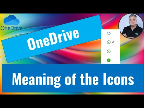
The video presents each icon in plain language and pairs the visuals with practical examples, making it easy to follow for a wide audience. Ami Diamond, who has a background in Microsoft services, frames the explanation as both a how-to and a quick reference. As a result, viewers can quickly tell whether a file will open offline, is still syncing, or requires attention.
Moreover, Ami emphasizes clarity over technical detail, which helps non-experts grasp the essentials in a few minutes. He also notes recent interface tweaks that aim to unify the appearance across devices and apps. Therefore, the video serves as both a tutorial and a brief update on the evolving look of OneDrive.
Reading the icons: what each symbol means
Ami walks through the main icons one by one, beginning with the Green Checkmark (Solid), which indicates a file is fully synced and available offline. He then explains the Cloud Icon, which means the file is online-only and consumes no local storage but needs an internet connection to open. Next, the video covers the Blue Circular Arrows, which signal that a file is actively syncing to match the cloud version.
In addition, Ami points out the Green Checkmark (Outlined), which indicates a locally available copy that may return to online-only status when the system needs space. He also describes the Red X, which signals a sync error and prompts users to check their settings or resolve conflicts. These clear labels help users decide whether to wait, free space, or investigate further.
Recent changes and the reasoning behind them
The video highlights that Microsoft updated the desktop icon to a cleaner, modern design to improve recognition across operating systems and apps. Ami explains that visual consistency matters for users who switch between devices, because uniform icons reduce confusion and speed up recognition. Furthermore, this update forms part of broader efforts to improve sync reliability and performance for OneDrive users.
However, he also notes tradeoffs: simplification can sometimes hide nuance, and changes may temporarily confuse people who are used to older visuals. For example, a new icon set may look similar across personal and work accounts, which could make account context less obvious. Thus, while the update increases aesthetic and functional consistency, it also requires users to relearn subtle cues.
Troubleshooting and the tradeoffs involved
Ami uses practical examples to show how to handle common issues, such as mismatched icons after an update or files that refuse to sync. He recommends basic steps like restarting the file explorer and checking account sign-in status, while warning that these fixes sometimes offer only temporary relief. Consequently, resolving persistent problems may require deeper checks, like verifying network settings or examining permissions.
The discussion also covers tradeoffs between local storage and online access: choosing online-only files saves disk space but risks leaving users offline without access. Conversely, keeping files available offline preserves access but consumes local resources. Balancing these factors depends on user priorities, such as mobility, storage limits, and whether instant availability is critical.
Implications for users and IT administrators
For everyday users, the video underscores the value of learning a few key icons to prevent lost time and confusion. Ami suggests simple habits like checking sync status before disconnecting from the network, which can prevent interrupted uploads or incomplete saves. Consequently, small behavioral changes reduce the chance of data conflicts and make backup choices more predictable.
For administrators, the video prompts broader considerations about default policies, such as opt-in settings for folder backup and how to communicate icon changes to staff. Ami stresses that organizational settings can simplify or complicate matters: tighter controls reduce user error but limit flexibility, while permissive setups give users freedom at the cost of inconsistent behavior. Ultimately, IT teams must balance centralized control with end-user needs.
Bottom line
Ami Diamond’s video offers a clear, user-focused guide to the OneDrive desktop icons and explains recent design and sync-related updates in plain terms. By combining visual examples with practical tips, the presentation helps both casual users and administrators make informed choices. Although design changes and sync tradeoffs remain, understanding these icons reduces friction and improves everyday file management.