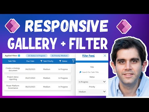
PowerApps Responsive Screen with Gallery & Filters
Power Apps
8. Mai 2023 12:30

PowerApps Responsive Screen with Gallery & Filters

von HubSite 365 über Reza Dorrani

Principal Program Manager at Microsoft Power CAT Team | Power Platform Content Creator

Citizen DeveloperPower AppsPower SelectionM365 Hot News

Welcome to this step-by-step Power Apps tutorial for beginners to advanced users. I will cover various topics related to building Canvas Power Apps

Power Apps Tutorial - Responsive Screen with Gallery & Filters - Beginner to Advanced is a comprehensive tutorial that covers all the basics of creating a Power App, from creating a new project to working with filters and galleries. It includes step-by-step instructions to help you create a fully functional, responsive app quickly and easily.

Welcome to this step-by-step Power Apps tutorial for beginners to advanced users. I will cover various topics related to building Canvas Power Apps - How to build a responsive screen in Power Apps, how to connect to a data source, how to build a responsive Gallery control and apply multiple filters to gallery data.

Firstly, I will show you how to create responsive canvas Power Apps and how to work with responsive design screen templates. I will also demonstrate how to use horizontal and vertical containers, which are essential tools in creating responsive layouts.

I will guide you through creating a responsive gallery control and filter panel and show you how to apply multiple filters to a Power Apps gallery. The filter panel (container) will allow users to make selections to search or filter gallery data. Additionally, the applied filters container will highlight the applied filters and users can remove specific filters or reset the filters if desired.

You will learn how to design PowerApps gallery to showcase it as a Table with responsive headers & how to search and filter power apps gallery data.

I will leverage Microsoft Dataverse as a data source. However, the techniques I will demonstrate can be applied to any data source, and I will also show you an example with SharePoint as a data source.

Table of Contents:


  • 00:00 - Introduction to Power Apps Responsive Design Tutorial with Gallery &
  • Filter Containers
  • 00:49 - Build a Responsive Power App
  • 01:31 - How to build a Responsive Screen Header
  • 03:40 - Build Responsive Gallery + Filters using containers
  • 05:03 - New drop shadow effect for Power Apps containers
  • 06:37 - Connect Power App to a Dataverse Table
  • 07:13 - Create Responsive Gallery & showcase like a Data Table
  • 10:05 - Add Responsive Column Headers for Power Apps Gallery
  • 12:31 - Show and Hide Power Apps responsive container controls
  • 13:40 - Enable responsiveness for a Power App by disabling scale to fit
  • 13:59 - Add Filters container for Power Apps
  • 14:48 - Reset Filters Button
  • 15:03 - Search function in Power Apps Gallery
  • 15:38 - Highlight Column Header when Filter is applied
  • 16:19 - Multiple Filters in Power Apps Gallery
  • 19:54 - Show applied filters in Power Apps
  • 23:09 - Responsive Power Apps Gallery with Filter Panel examples
  • 24:12 - Subscribe to Reza Dorrani Channel

Basic Setup for Power Apps tutorial on responsive screens!


  1. Create a New App: Open Power Apps, and create a new blank canvas app.
  2. Choose a Screen Size: From the Home tab, click on the “Screen size + orientation” button in the top-right corner of the screen. Choose a screen size from the drop-down list.
  3. Enable Responsive Mode: Once you’ve chosen a screen size, click on the “Responsive mode” button in the same area as the screen size button. This will enable responsive mode and allow you to design your app to be compatible with different screen sizes.
  4. Create Layouts: In responsive mode, you can create multiple layouts for your app. Click on the “Add layout” button to create a new layout. You can then design each layout to be optimized for different screen sizes.
  5. Configure Controls: As you design your app, you’ll need to configure the controls to be responsive. To do this, click on a control and go to the “Layout” tab. Here, you can set properties such as the control’s width, height, and position relative to the screen.
  6. Preview Your App: Once you’ve created your layouts and configured your controls, you can preview your app in responsive mode. Click on the “Preview” button in the top-right corner of the screen, and choose “Phone layout” or “Tablet layout” to see how your app looks on different screen sizes.
  7. Test Your App: Finally, test your app on different devices to ensure that it’s truly responsive. You may need to make adjustments to your layouts and control configurations to make sure that your app works well on all screen sizes.

I hope that helps you get started with building a responsive screen in Power Apps! Let me know if you have any other questions.

Jul 4, 2021 — Lets create responsive card view using gallery control in power apps.- To activate responsiveness turn off the app's Scale to fit setting, ...

Dec 15, 2022 — To show these properties, open an app in Power Apps Studio, and then select a screen. The default formulas for these properties appear on the ...

Dec 15, 2022 — Learn about how to build responsive canvas apps. ... Stretch or resize with the screen size changes. ... Go to Power Apps.

Jan 26, 2022 — I add the collection to the items of the gallery and edit the gallery to include the required labels/icon etc from the collection. and this is ...

Mehr zu Power Apps

Wir schätzen Ihre Privatsphäre

Diese Website speichert Daten wie z.B. Cookies, um wichtige Funktionen der Website sowie Marketing, Personalisierung und Analyse zu ermöglichen. Sie können Ihre Einstellungen jederzeit ändern oder die Standardeinstellungen akzeptieren. Datenschutzerklärung.