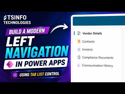
Power Apps Left Sidebar with Tab List
Microsoft expert guide to building a modern left navigation in Power Apps with Tab List control and Power Platform
Key insights
- Tab List: This video shows the modern Power Apps Tab List control and how it can become a vertical left navigation menu for canvas apps.
It preserves item order, supports built-in styles, and simplifies navigation setup. - Sidebar: Configure the Tab List vertically and bind it to a data source so each record becomes a clickable menu item.
Selecting an item can navigate to a screen, reveal a section, open a URL, or run other Power Fx actions without custom components. - Navigation data: Store menu entries in a collection or table with fields like Label, Target, Screen, Icon, and Permissions.
This central data model makes adding, removing, or reordering menu items simple and consistent. - Power Fx: Use straightforward Power Fx formulas to read the selected tab and trigger Navigate(), set component visibility, or run logic for permissions and routing.
The video walks through the selection logic and example formulas step by step. - Appearance options: The control offers four looks—Transparent, Subtle, Underline, and Filled—so you can match Microsoft Fluent design without building custom visuals.
That reduces manual styling work and ensures a consistent UI. - Responsive behavior: The Tab List supports responsive layouts, overflow or flyout handling when width is limited, and built-in keyboard and screen-reader accessibility.
These features help build a usable, maintainable sidebar for different devices and users.
Overview of the Video
The recent YouTube video from TSInfo Technologies demonstrates how to build a modern left navigation menu in Power Apps using the Tab List control. The presenter walks viewers through a step-by-step explanation of properties, customization options, and a real-world implementation that aims to replace more complex custom components. Overall, the video focuses on improving the user experience for canvas apps while using built-in modern controls to reduce maintenance overhead.
Importantly, the author emphasizes practical patterns rather than abstract theory, showing how a vertical configuration of the control can act as a reusable sidebar. The video also highlights recent Microsoft updates that make the approach more stable and accessible. As a result, makers can adopt a consistent look and feel while retaining flexibility for varied app scenarios.
How the Tab List Control Works
The video explains that the Tab List control accepts a table, collection, or list of values as its Items source, which the control then renders as selectable entries. Each item can include a label, an associated screen or target, and optional metadata such as icons or permission flags. By connecting the control to a data source, developers can let the navigation reflect data-driven order and content rather than hard-coded buttons.
Further, the presenter demonstrates using the selected tab to drive navigation through Power Fx formulas, which either navigate to a new screen or toggle visibility for sections on the current screen. This pattern supports both persistent sidebars and flyout behaviors, and it works well when you need predictable selection handling across an app. Consequently, the approach simplifies the logic that otherwise requires multiple controls and custom state variables.
Design and Customization Options
The video details several styling options available in the control, noting built-in appearances such as Transparent, Subtle, Underline, and Filled. These presets let makers achieve a minimalist sidebar or an emphasized active item without heavy custom styling. In addition, the control supports icons and ordering so that the menu aligns with common navigation patterns like Home, Dashboard, Reports, and Settings.
Moreover, the author shows how to wire the control to a collection for easier maintenance, allowing changes to labels, targets, or permissions in one place. This design choice reduces duplication and makes it simpler to add or reorder items. As a result, developers gain a clear separation between navigation data and visual presentation, which helps teams iterate faster.
Tradeoffs and Challenges
While the Tab List control reduces implementation complexity, the video candidly explores tradeoffs that developers must weigh. For example, using the control ties your layout to the built-in appearances, which can limit extreme visual customization compared with fully custom component approaches. Therefore, teams that need pixel-perfect, branded navigation may still opt for custom solutions despite additional effort.
Additionally, the video covers accessibility and responsiveness tradeoffs, noting that built-in support improves keyboard and screen-reader behavior but that developers still must test on various breakpoints. When screen width is constrained, designers must choose between a persistent sidebar, which can consume valuable space, or a flyout pattern, which requires careful handling of focus and overflow. These choices affect discoverability, performance, and maintenance burden in different ways.
Implementation Tips and Best Practices
The presenter recommends a four-part architecture for robust navigation: a navigation data source, the Tab List control itself, selection logic via Power Fx, and destination behavior that either navigates screens or toggles content visibility. By separating those concerns, developers can reuse the same navigation structure across multiple apps or screens. Consequently, this pattern supports scaling and reduces the chance of errors when updating navigation entries.
Finally, the video encourages testing and iterative refinement, including verifying order preservation, permissions handling, and mobile layout behavior. The speaker also suggests storing navigation items in a maintainable collection so non-developers can update labels or visibility rules when requirements change. Thus, the approach balances ease of use with practical governance and long-term maintainability.
Conclusion
In summary, the tutorial from TSInfo Technologies offers a clear and pragmatic path for building a left navigation menu in Power Apps using the modern Tab List control. It combines hands-on configuration steps with thoughtful discussion of tradeoffs, such as styling limits versus faster maintenance and built-in accessibility versus custom behavior. As a result, makers can adopt a modern, maintainable sidebar that serves many common app scenarios without rebuilding navigation from scratch.
For newsroom readers and app builders, the video provides actionable guidance and practical warnings that help teams decide when to use the control and when to invest in custom patterns. Therefore, the tutorial serves as a useful reference for teams aiming to modernize Power Apps navigation while balancing usability, accessibility, and long-term upkeep.

Keywords
Power Apps left navigation, Power Apps sidebar menu, Tab List control Power Apps, modern navigation Power Apps, build navigation Power Apps tutorial, Power Apps menu design, responsive Power Apps sidebar, Power Apps navigation best practices