SharePoint Lists: Customize View Display
M365 Adoption Lead | 2X Microsoft MVP |Copilot | SharePoint Online | Microsoft Teams |Microsoft 365| at CloudEdge
SharePoint Lists adds view display choice for cleaner navigation and better usability in Microsoft Lists and SharePoint
Key insights
- YouTube video summary about SharePoint Lists: the clip explains a new setting that gives admins control over how list views appear in the modern SharePoint interface.
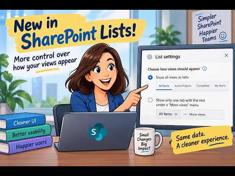
- Setting & location: the option appears in List Settings → Advanced Settings as Choose how views should appear, letting you pick between All views as tabs or a single tab with a More views menu.
- How users change views: open View options to switch view styles like List, Compact List, Tiles or Gallery, or to create and configure views with columns, sort, and filters.
- View formatting lets you change the list’s presentation (JSON-based) without altering the underlying data, so teams can tailor appearance for clarity and workflow.
- Cleaner navigation and less visual clutter improve usability by freeing screen space and helping users find the right view faster, which fits modern workplace needs.
- Adoption boost: this small UI change reduces friction and can increase user acceptance; note the setting is visible in Lists today but not yet in Document Libraries, so choose the option that suits your users’ habits.
Overview of the video
Ami Diamond [MVP] published a concise YouTube video that highlights a small but useful update in SharePoint Lists. He demonstrates a new setting that lets list owners decide whether to show all views as tabs or to surface only one tab while placing the rest under a More views menu. In the video, he explains why this option can reduce visual clutter and make the interface easier for people who work with many views. Overall, Ami frames the feature as a usability improvement rather than a major functional overhaul.
Moreover, he walks viewers through where to find the control in List Settings → Advanced Settings and compares the two display options side by side. He also notes that, at the time of recording, the setting appears in SharePoint Lists but not yet in Document Libraries. Consequently, his practical demonstration targets teams that rely heavily on lists for task tracking, reporting, and process management.
What exactly changed
The video focuses on a single toggle: choose to show all views as tabs, or show only one tab and place remaining views under a More views menu. Ami shows how the navigation bar can become crowded when a list accumulates many views, and how the new option cleans up the top of the page. He emphasizes that the underlying data and view definitions remain unchanged; only the presentation and navigation behavior are altered. Thus, the change is purely interface-oriented but can influence how quickly users find what they need.
In addition, Ami highlights that this setting complements existing view options such as List, Compact List, Tiles, and other display modes available from View options. He also points out that view formatting remains available for teams that want to customize how rows and fields look without modifying the data model. Therefore, the setting fits into Microsoft’s broader move toward flexible presentation without forcing structural changes.
Benefits and tradeoffs
First, the update delivers clear usability gains: a cleaner navigation bar makes it easier for users to locate the primary view and reduces cognitive load for infrequent users. As Ami notes, when users can find what they need faster, adoption and satisfaction tend to rise. Furthermore, the More views menu preserves access to secondary or rarely used views while reducing visual noise for day-to-day tasks. In short, the change improves discoverability for common views and organizes less-used options out of immediate sight.
However, there are tradeoffs to consider. For power users who switch frequently among many views, hiding views behind a menu could add a small interaction cost. Also, teams that trained users to click specific tabs might need to update internal documentation or quick reference guides. Finally, because Document Libraries did not show the same setting at the time of the video, organizations that rely equally on libraries and lists may face inconsistent interfaces across similar content types. These tradeoffs mean administrators should weigh convenience for most users against the needs of specialists.
Practical challenges and implementation
Ami’s walkthrough also touches on implementation details and potential hurdles for IT teams. He shows that the change lives in List Settings → Advanced Settings, which means list owners or administrators must enable the option where appropriate. Consequently, rollout can be handled list-by-list, allowing teams to pilot the display choice on high-traffic lists before broad adoption. This granular control supports cautious deployments but can increase administrative overhead if many lists require manual updates.
Another challenge relates to consistency and governance. When different lists use different view display settings, users might face varied navigation patterns across sites, which can be confusing at scale. Therefore, governance teams will need to document a recommended approach and decide whether to standardize the setting across key templates. Ami recommends starting with the lists that get the most traffic and measuring user feedback before committing to a widespread change.
What this means for teams and next steps
Looking ahead, the update signals that Microsoft continues to refine the SharePoint interface with small, practical improvements that reduce friction. As Ami suggests, not every update must be revolutionary to improve daily productivity; sometimes subtle UI changes yield disproportionate benefits. Teams should evaluate whether the cleaner navigation helps their everyday workflows and plan a staged rollout if they manage many lists.
Finally, administrators should monitor for broader availability and parity with Document Libraries, because a unified experience across lists and libraries would simplify governance. In the meantime, teams can use Ami Diamond’s video as a quick demo to help stakeholders understand the change, try both display options in a pilot list, and then choose the approach that best balances clarity and access for their users.

Keywords
SharePoint Lists view customization, Choose views appearance SharePoint, SharePoint list view options, Modern SharePoint list views, Configure SharePoint list views, SharePoint view formatting, New SharePoint Lists features, Customize list display SharePoint