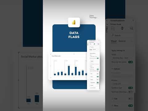
Power BI: Boost Report UX with Smart Data Flags
Power BI Power BI Desktop DAX
Key insights
- Power BI is a business analytics tool from Microsoft that helps users create interactive visualizations and reports for better data analysis.
- Data Flags are markers or indicators in data visualization, used to highlight important trends or anomalies, making key information stand out in reports.
- DAX (Data Analysis Expressions) is a formula language in Power BI used for creating calculations, measures, and relationships within your data models.
- The latest Card Visual Enhancements include new accent bars, improved reference label layouts, and tabular layout styles, all designed to make reports more visually appealing and easier to read.
- Core Visuals Improvements now offer flexible reference lines and the ability to style small multiples in grid or card formats, giving users more options for customizing their dashboards.
- The March 2025 update brings improved start-up performance and better language understanding for data questions, which makes the overall User Experience (UX) smoother and more intuitive for everyone using Power BI.
Introduction: Enhancing Power BI Reports with Data Flags
Power BI, the business analytics platform from Microsoft, has continued to innovate in the field of data visualization and user experience. A recent YouTube video by the channel How to Power BI explores the concept of using "Data Flags" in Power BI visuals, emphasizing how these features can transform the way reports are designed and consumed. While the term "Data Flags" is not a standard feature within Power BI, it generally refers to visual markers or indicators that highlight key data points, anomalies, or trends within a report. This approach is part of a broader movement to make data analysis more accessible and actionable for users at all levels.
By leveraging these enhancements, report creators can significantly improve the usability and impact of their dashboards. As Power BI continues to evolve, understanding the tradeoffs and challenges involved in implementing advanced visual cues becomes increasingly important for organizations seeking to maximize the value of their data.
What Are Data Flags and Why Do They Matter?
In the context of Power BI, Data Flags function as visual signals that draw attention to specific data conditions. For instance, a flag might indicate when a sales target is missed, highlight outliers in a dataset, or call out significant changes over time. These flags can be implemented through conditional formatting, custom icons, or calculated columns using DAX (Data Analysis Expressions).
The primary benefit of using data flags is their ability to make reports more intuitive. Instead of requiring users to sift through raw numbers, flags visually guide them to the most important information. However, there is a balance to strike; too many flags can clutter a report and overwhelm the viewer, while too few may result in missed insights. Therefore, careful consideration is needed to determine which data points truly warrant attention.
Key Features and Recent Enhancements in Power BI Visuals
The video highlights several recent updates to Power BI that support the implementation of effective data flags and improve overall report design. Notably, the introduction of new card visual enhancements allows for accent bars, improved reference label layouts, and tabular styling. These features enable designers to present flagged data in a clear, visually appealing manner.
Additionally, improvements to core visuals include more flexible reference lines and the option to style small multiples in both grid and card layouts. These updates provide users with greater flexibility and control over how data is displayed, making it easier to emphasize critical values through visual cues. Furthermore, performance improvements and enhanced language understanding for data questions simplify the process for end-users to engage with and interpret their reports.
Balancing Customization and Usability in Report Design
Customizing Power BI reports with data flags and advanced visuals offers undeniable advantages. Users gain the ability to tailor dashboards to specific business needs, ensuring that important trends and exceptions are immediately visible. However, this flexibility comes with challenges. Over-customization can lead to inconsistent report standards across an organization, potentially confusing users who access multiple dashboards.
Moreover, the process of designing and maintaining highly customized reports often requires advanced Power BI skills, particularly in DAX and visual formatting. Organizations must weigh the benefits of bespoke visualizations against the resource investment needed for ongoing development and support. Finding the right balance between customization and standardization is essential for sustainable, scalable reporting.
The Future of Power BI UX: Opportunities and Challenges
As Power BI continues to introduce new features and enhancements, the opportunities for improving report user experience will expand. The integration of data flags and other advanced visual elements positions Power BI as a leader in intuitive, actionable business intelligence. However, report designers must remain mindful of the user journey, avoiding unnecessary complexity while maximizing informational value.
Ultimately, the successful adoption of data flags and similar features depends on a thoughtful approach to report design. By focusing on clarity, relevance, and consistency, organizations can harness the full potential of Power BI to drive better decision-making and foster a data-driven culture.

Keywords
Power BI report UX Data flags Power BI visuals improve report usability data visualization tips Power BI user experience enhance reports