Power Apps
17. Feb 2025 18:33
Power Apps: How to Add a Responsive Gallery to Your Power Apps Form
von HubSite 365 über Andrew Hess - MySPQuestions
Currently I am sharing my knowledge with the Power Platform, with PowerApps and Power Automate. With over 8 years of experience, I have been learning SharePoint and SharePoint Online
Power Apps Power Automate Microsoft 365 Azure AI Dynamics 365 Surface Devices Windows 11 Teams Visual Studio
Key insights
- Responsive Gallery: A dynamic component in Power Apps that adjusts its layout based on the device's screen dimensions, enhancing the user experience across desktops, tablets, and smartphones.
- Advantages: Implementing responsive galleries improves user experience, accessibility, and maintenance efficiency by ensuring consistent interfaces and simplifying updates for different screen sizes.
- Step-by-Step Guide:
- Set up your Power Apps environment by accessing Power Apps Studio and selecting appropriate screen size settings.
- Insert a gallery control, connect it to a data source like SharePoint or SQL database.
- Configure responsive layout using containers and dynamic dimensions for width and height properties.
- Add modern controls such as headers and badges for additional information display.
- Test across devices using Power Apps Studio preview feature to ensure desired responsiveness.
- Best Practices: Use containers consistently for layout management, prefer percentage-based dimensions for sizing, adjust font sizes responsively, and regularly test on various devices.
- Modern Controls: Enhance your gallery with customizable headers, badges, and responsive fonts to improve readability and adaptability to different screen sizes.
- User Experience Focus: By following these guidelines, create a seamless and engaging experience in Power Apps forms that caters to users on any device.
Introduction to Responsive Galleries in Power Apps
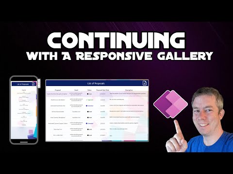
Creating a responsive gallery within your Power Apps form is a significant step towards enhancing user experience. This approach ensures that your application displays seamlessly across various devices and screen sizes. The YouTube video by Andrew Hess from MySPQuestions provides a comprehensive guide on integrating a responsive gallery into your Power Apps form, utilizing modern controls and design principles. Responsive galleries in Power Apps dynamically adjust their layout based on the device’s screen dimensions, offering an optimal viewing experience. This adaptability is crucial for applications accessed on multiple devices, from desktops to tablets and smartphones. The video outlines the advantages of implementing responsive galleries, including enhanced user experience, improved accessibility, and efficient maintenance.Advantages of Implementing Responsive Galleries
Responsive galleries offer several benefits that make them a valuable addition to any Power Apps form:- Enhanced User Experience: Responsive galleries ensure consistent and user-friendly interfaces across all devices. By adapting to different screen sizes, they provide a seamless experience for users, whether they are on a desktop or a mobile device.
- Improved Accessibility: These galleries cater to users on various platforms without compromising functionality or aesthetics. This inclusivity ensures that all users can access the application with ease.
- Efficient Maintenance: With responsive design, updates are simplified as changes adapt automatically to different screen sizes. This reduces the need for extensive rework when modifying the app's layout or content.
Step-by-Step Guide to Adding a Responsive Gallery
The video provides a detailed step-by-step guide to adding a responsive gallery to your Power Apps form:- Set Up Your Power Apps Environment: Begin by accessing Power Apps Studio. Log in to Power Apps and open your existing app or create a new one. Choose the appropriate screen size by navigating to Settings > Display, and select the desired orientation and screen size. Ensure that "Scale to fit" is turned off to allow for responsiveness.
- Insert a Gallery Control: On the left pane, select Insert > Gallery, and choose a layout that suits your data representation needs. Connect the gallery to your data source, such as a SharePoint list or a SQL database.
- Configure Responsive Layout: Utilize containers to structure your gallery items. Incorporate vertical and horizontal container controls to maintain alignment and spacing across different screen sizes. Adjust the Width and Height properties of the gallery and its items using formulas relative to the parent container or screen size.
- Incorporate Modern Controls: Enhance your gallery with modern controls like headers and badges to display additional information and statuses. These controls are customizable and adapt to various screen sizes. Implement responsive fonts to ensure text readability by setting font sizes relative to screen dimensions.
- Test Across Devices: Use the preview feature in Power Apps Studio to observe how your gallery behaves on different screen sizes. Refine your design by tweaking container properties and control settings to achieve the desired responsiveness.
Best Practices for Responsive Design in Power Apps
To create a responsive gallery that offers a seamless and engaging experience for all users, consider the following best practices:- Consistent Use of Containers: Organize your layout with containers to manage control positioning and scaling effectively. This approach ensures that your gallery maintains its structure across different devices.
- Relative Sizing: Prefer percentage-based dimensions over fixed values to accommodate various screen sizes. This flexibility allows your gallery to adapt to different devices without losing its intended design.
- Responsive Font Scaling: Adjust font sizes using relative measurements to maintain readability across devices. This ensures that text remains legible, regardless of the screen size.
- Regular Testing: Continuously test your app on different devices to ensure a consistent user experience. Regular testing helps identify any issues that may arise due to varying screen dimensions.
Conclusion
By following the steps and best practices outlined in Andrew Hess's video, you can successfully create a responsive gallery within your Power Apps form. This addition enhances user experience by providing a seamless and engaging interface for all users, regardless of their device. For a visual demonstration and further insights, watching the tutorial is highly recommended. The video serves as a valuable resource for anyone looking to improve their Power Apps forms with responsive design principles.

Keywords
Power Apps responsive gallery add tutorial guide form integration design tips 2025
HubSite 365 Apps