Power BI
20. Mai 2025 19:55
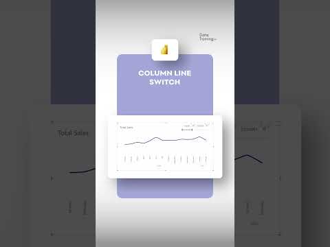
Power BI: Instantly Toggle Between Line & Column Charts
von HubSite 365 über How to Power BI
Dynamic chart switch in Power BI YouTube video highlights seamless transitions and data visualization using Microsoft tools.
Key insights
- Dynamic Switching: Power BI lets users easily switch between line charts and column charts within the same visual, making reports more interactive and flexible.
- Space Efficiency: By using one visual that can display different chart types, users save space on their report canvas, which helps keep reports organized and simple to navigate.
- Enhanced Interactivity: Users can explore data from multiple perspectives by toggling between chart types with just a click, improving the overall experience without needing extra visuals or pages.
- Bookmarks and Buttons: This feature uses bookmarks to save different chart states and buttons to let users switch between those states quickly in the report.
- Improved Visual Options: Recent updates allow switching not only between vertical and horizontal charts but also customizing marker styles with shapes or icons for more personalized visuals.
- Field Parameters: Users can now dynamically change measures within a single visual, adding even more flexibility for analyzing data without leaving the current view.
Keywords
Power BI dynamic charts Power BI line to column switch Power BI chart toggle Power BI visualization tips Power BI interactive charts Power BI data visualization techniques Power BI chart customization Power BI dashboard design
HubSite 365 Apps