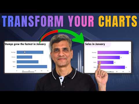
Introduction to the video
The YouTube video by Presentation Process YouTube offers a focused tutorial titled “5 Stunning Bar Chart Animations in PowerPoint.” In clear steps, the presenters demonstrate how to make bar charts reveal data progressively so audiences can follow the story behind the numbers. Moreover, the video emphasizes clean design and sequencing to turn ordinary charts into professional visuals that support a spoken narrative.
Why animated charts matter
Animated charts improve comprehension because they guide attention and pace the reveal of information, which reduces cognitive load for viewers. For example, showing one series or category at a time helps listeners match your commentary with the corresponding visual, and therefore strengthens the message. Additionally, the presenters explain that animation fosters engagement without adding complexity when used purposefully rather than decoratively.
Overview of the five techniques
The tutorial walks through five specific approaches: a classic reveal using Wipe, transforming charts with icons to create visual stories, animating AI-generated chart images, a slider-style comparison, and using Morph to show performance changes. Each technique pairs an animation effect with careful timing and sequencing, which the hosts demonstrate in a step-by-step manner. Consequently, viewers can see practical examples and replicate the effects in their own slides.
Technique details and practical steps
First, the video shows how to apply the Wipe effect and then refine it via Effect Options to reveal bars From Bottom, often combined with grouping like By Category or By Series. Next, the presenters recommend turning specific bars into visual anchors by pairing icons and labels, which makes comparisons more memorable for the audience. They also demonstrate how to animate static chart images generated by AI tools, explaining that such images can be brought to life through layered entrance effects and masks.
Advanced comparisons and Morph usage
The slider animation and the use of Morph receive particular attention because they handle comparative storytelling well, especially when showing before-and-after scenarios. In these segments, the hosts show how to simulate a sliding scale and how to animate the transformation of one chart state into another with smooth transitions. By contrast, they caution that Morph requires consistent object naming and slide structure to work reliably, which adds a setup step but yields polished results.
Trade-offs when choosing an approach
Choosing among these techniques involves trade-offs between control, complexity, and compatibility. For instance, the classic Wipe effect is widely compatible and simple to set up, but it offers less visual flair than a custom icon-driven reveal or a Morph transformation. Conversely, advanced approaches like animating AI-generated images or using Morph provide richer visuals but demand more careful preparation and may behave differently across PowerPoint versions.
Challenges and limitations
The tutorial also addresses practical limitations, such as version differences in PowerPoint and variations across chart types that affect how animation settings apply. In addition, fine-tuning timing and sequencing can be fiddly; for example, using By Series or By Category influences the order in which elements appear and can produce unexpected results if data series contain many items. Finally, the presenters note that animated charts may not translate perfectly when exporting slides to other formats, so presenters should test their delivery environment before presenting.
Balancing polish with simplicity
Importantly, the video advocates balancing visual polish with clarity: simpler animations often communicate more effectively than elaborate motion if they support the story. Therefore, presenters should prioritize which data points to emphasize and then choose the least complex animation that still draws attention. In this way, presenters can enhance comprehension without distracting viewers from the main message.
Practical tips and accessibility
To help viewers implement the effects, the hosts recommend using the Animation Pane for precise timing, testing slide playback, and grouping chart elements for consistent behavior. They also advise checking accessibility needs by ensuring that animations do not trigger motion sensitivity for some audience members and by providing alternative static visuals when necessary. Overall, the video balances how-to instruction with pragmatic advice for real-world presentation scenarios.
Conclusion and how to use the lesson
In summary, the Presentation Process YouTube tutorial offers actionable techniques that range from quick, compatible reveals to more elaborate transitions for storytelling. Viewers should weigh the trade-offs of ease versus effect, test across platforms, and choose animations that serve clarity above all. Finally, by combining good sequencing, clean visuals, and thoughtful pacing, presenters can make bar chart data far more engaging and easier to understand.