- All of Microsoft

Power Apps Mobile Navigation Menu Creation - Gallery Part 2
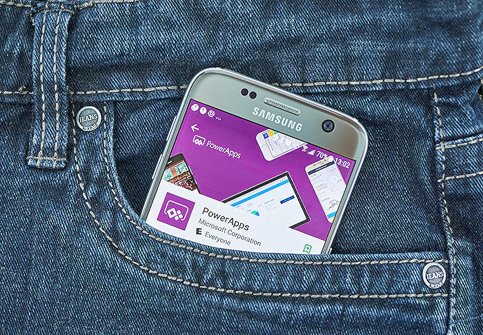
Learn to create stunning mobile navigation menus on Power Apps with a step-by-step guide from a Microsoft Expert.
Building a Beautiful Mobile Navigation Menu with Power Apps - Gallery
The second part in this blog series by Kristine Kolodziejski takes us through the steps of creating a mobile navigation menu using the Gallery control within Microsoft's Power Apps.
In the building process, a Vertical Gallery is added to your screen, with its layout changed to ‘Title only’ and omitting any unnecessary separators.
Next, the blog introduces the concept of generating a table with menu items. An example includes creating three screens, Home, Profile, and Settings, each item having three components - ScreenName, Navigation, and MenuLogo. Here the ScreenName is a text label for the menu, the Navigation is the active screen upon selection and the MenuLogo identifies the screen.
More on Power AppsFollowing this, we learn various properties such as Wrap count recommending maximum of five items, Template size determining the size of the menu item, and the renaming process to MenuIcon and MenuItem for easier identification.
Moving the items around the gallery, placing both the icon and title in the middle, it's suggested to use formula (YourGalleryName.TemplateWidth - Self.Width)/2. Changing the title and icon in reference to the created table and adjusting the alignment for better aesthetics is also discussed.
To enhance user interaction, a transparent button that overlays each gallery item pops up when hovered over. Customization options regarding button properties include Fill, Height, Width, Text, and Tooltip, among others. The changes make the user interface more accessible and clear.
At the end, to indicate the user's location within the application, a circle icon is added. This adjusts accordingly to the current screen. Modifications to these properties including X and Y placement and visibility are explained.
Furthermore, Kolodziejski elaborates on enhancing the user experience by differentiating the color of the icon for the active page and making other icons lighter. She also guides through grouping the HTML control and the Gallery for a future component incorporating both.
Finally, updating the Gallery items to implement the actual screen names and replicating the menu onto all screens, one can achieve a complete menu.
Although a lengthy process, the blog promises accuracy, customizability, and an easy user interface. Look forward to the upcoming blog for replacing icons with SVG’s for a more appealing user interface.
Read the full article Building a beautiful Power Apps mobile navigation menu - Gallery (Part 2)
Learn about Building a beautiful Power Apps mobile navigation menu - Gallery (Part 2)
Welcome to part II of our post series, where we're developing a striking and user-friendly navigation menu in Power Apps. In this post, we will delve into the details of creating the menu with the Gallery control, which we will subsequently layer atop the HTML control established in the previous post.
To start, add a Vertical Gallery to your screen. Switch the Gallery's layout to 'Title only' using the menu on the right. You'll notice a default separator in the Gallery - you won't need it, so please go ahead and remove it.
Next, supply some items to display in your gallery. For this tutorial, we're crafting a concise table with three items. These items will function as our menu items: Home, My Profile, and Settings screens. To do that, we're going to apply the Table() function and generate three columns - ScreenName, Navigation, and MenuLogo.
- ScreenName - This is the screen name. It can be useful if you opt to add a text label to your menu.
- Navigation - This represents the screen you proceed to when you select the item. For this tutorial, we'll set this to App.ActiveScreen.
- MenuLogo - This will be the screen's logo. We will employ in-built icons in this post, however, stay tuned for a forthcoming post later this week on the application of SVGs in our menu!
Your Gallery should now look like this. Don't fret about the icon title; we'll alter this shortly.
Our next task is to modify a few properties in our menu:
- Wrap count, which denotes the number of items in your menu. To optimize mobile navigation, it is recommended to have a maximum of five items.
- Template size determines the dimension of the menu item. For this post, we're setting it to 100.
- Now, let's reposition the items in the gallery neatly. Both the icon and the title of the menu item should be situated precisely in the center of the template. To achieve this, you will need to adjust the X property of both the icon and the label to calculate the exact spot.
We are now ready to change the title and icon of our menu! To do this, we reference the table we created previously within the Items property of our gallery.
To enhance the functionality and accessibility of our menu, we also add a hover-over button which overlays each gallery item, making it apparent that they have hovered over an element.
Let's adjust the button. Update the following properties:
- Fill - Set it to Transparent
- Width & Height - Set it to YourGalleryName.TemplateWidth and YourGalleryName.TemplateHeight respectively (or a custom width if you prefer)
- Also, remember to set Tooltip and OnSelect values.
By adjusting these properties, your menu will now look like this when you hover over one of the items:
We're almost there. To help our users navigate and understand their current position in your application, we're going to place a circle icon on our gallery. You will need to adjust some of the properties mentioned below:
- X - to place it in the middle
- Y - to place the circle underneath the menu icon
- Height & Width - please set both to 20.
- Visible - we only want the circle to be visible for the current screen
- Fill - we want the fill to be the same as the color of our icon.
Almost there! To enhance the user experience, we need to differentiate the icon color of the current screen from other icons. Our final step requires us to group the HTML control and the Gallery together.
The menu is now ready. All you need to do now is create three sample screens and update the Gallery items with actual screen names. The circles in your menu will disappear. Just copy and paste your menu onto the three screens we've added previously and voila - your menu is ready!
That's it for this tutorial. I hope it has been useful and has answered all your queries. The next tutorial will cover replacing icons with SVGs for an enhanced User Interface. So, stay tuned and don't forget to subscribe to our posts not to miss it!
Thank you!
More links on about Building a beautiful Power Apps mobile navigation menu - Gallery (Part 2)
- Building a beautiful Power Apps mobile navigation menu
- Jun 16, 2022 — In this post, Kristine shows how to build the menu for the mobile PowerApps by using the Gallery control. This control will be layered on top of ...
- Building a beautiful Power Apps mobile navigation menu
- Part 2 - Creating the menu items using a gallery,; Part 3 - Swapping the static icons to SVG's,; Part 4 - Creating a reusable components from the elements we've ...
Keywords
Power Apps mobile navigation, Beautiful Power Apps, Power Apps menu, Power Apps gallery, Mobile Navigation menu, Building Power Apps, Power Apps Part 2, Gallery Power Apps, Navigation Power Apps, Power Apps design.